In the coming weeks, we will update the SilverCloud platform theme with our new branding. While none of your current workflows will be impacted by this update, we encourage you to review the release notes below to understand the visual changes we’re making to the platform.
Why we have rebranded the platform
SilverCloud recently went through a major rebrand, which included a new logo, a new style guide, and new design principles. The old brand had served us well for almost 10 years, but it was time for a change. While end-users reported a feeling of calm in the old platform, we also received feedback that it was starting to look dated. We also received feedback that the old SilverCloud ‘blue’ felt overly clinical as we had originally focused on digitally recreating the therapist's room.
The goal for rebranding the platform was to bring it in line with the Sage archetype that the brand is based on. A ‘Sage’ brings to mind someone that is called upon to for knowledge and information, the sage is a trusted voice of authority that is focused on helping people and promoting continuous learning.
Seamless experience

We set out to create a seamless experience across all end-user touchpoints and our marketing collateral is now vibrant and inviting. When people arrive to our platform we want them to feel a warm embrace as they begin their journey and we want to ensure that their continued experience on the platform and as they engage with their coach is calm and peaceful. While each touchpoint imparts a different feeling, there is a clear and consistent thread guiding the person on their journey.
Examples of the new platform
Click-thru
The best way to get a sense of the what the new changes look like is to see the new pages in full: Link to click-thru
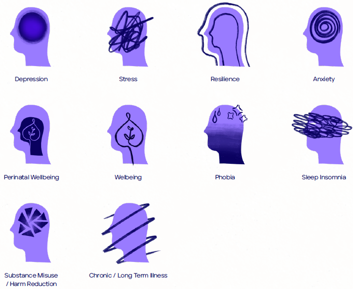
Illustrations:
While the core components of the platform aim for a peaceful and calm expression, the character illustrations are designed to stand out from the content. The old characters were intended to be neutral, while the new characters are bright, vibrant, and relatable. They are seen more in context, reflecting the different ways someone might use the platform.

Elsewhere, we will use a calm, abstract illustration style to create a more experiential accompaniment to the content – a pause for thought and reflection.


Tool Icons

Program icons

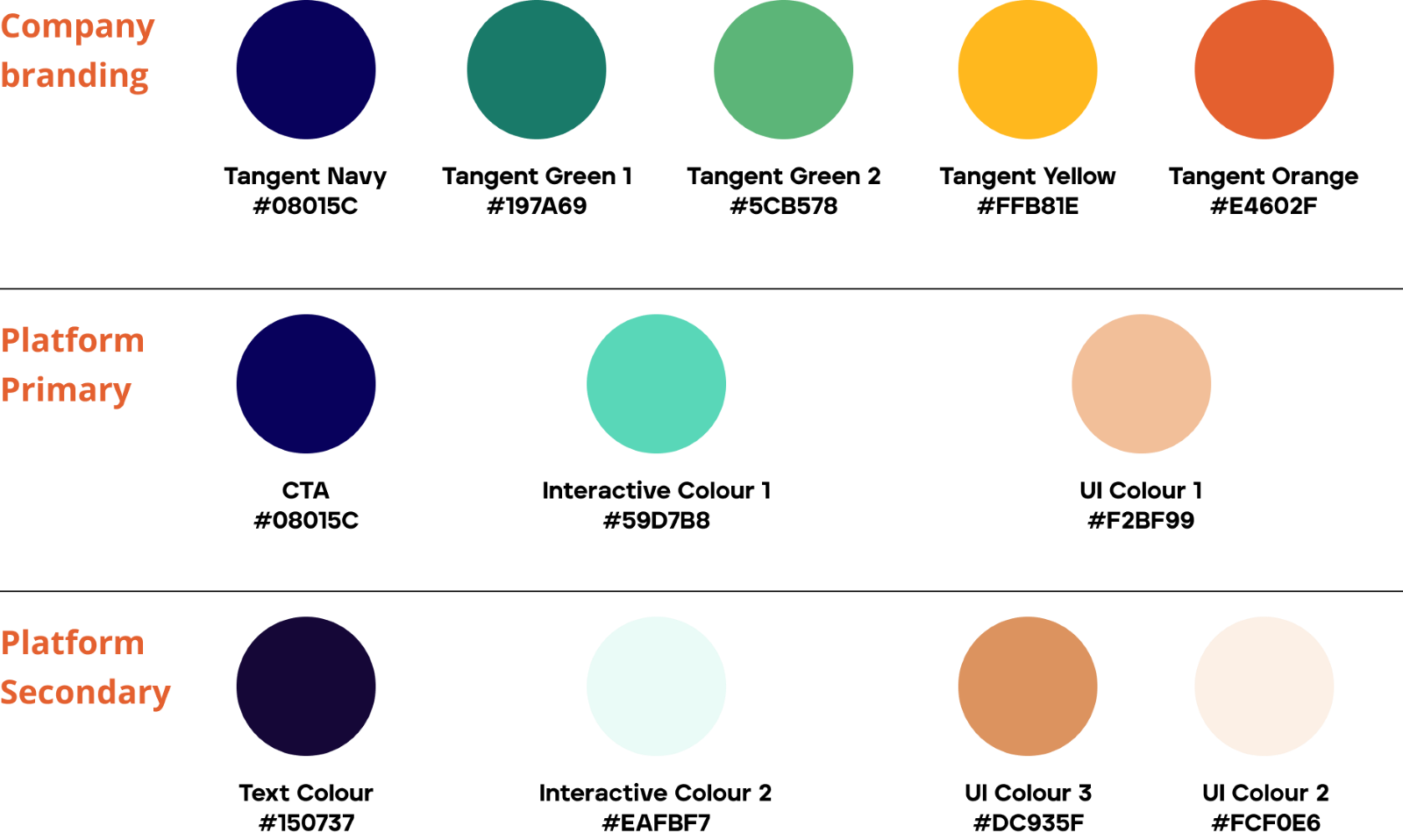
Platform Colour Palette
The platform colours are an extension of the company branding, reconfigured to meet the calmer feeling required for regular platform engagement. They are much warmer than the previous colours, creating a peaceful space without feeling clinical.

During this process, we have also upgraded the accessibility of the platform, ensuring all areas meet the standards set out by WCAG for colour contrast.
Supporter side changes
The supporter and administrative side of the platform will also inherit the colour styles used on the end-user side of the platform. All workflows and functionalities will remain the same.
Real user feedback
About the overall design:
“Much more relatable and easier on the eye”
“Love the colours, I think they have a relaxing/ calming effect”
About the character design:
“So much better and representative”
“Looking much more realistic”
Comments
Article is closed for comments.
0 comments