On April 15th, 2021, a new version of the reporting dashboard will be released. We have made enhancements to support our customer’s range of reporting needs by improving the usability with new filtering capabilities, segmenting data for ease of use and enabling exporting options. We have segmented the dashboard data into four main categories to easily present the data and evaluate metrics that are important for measuring success.
- Clinical outcomes
- Usage stats
- Engagement
- Coach metrics
See below for further details on each on these categories.
Filters
We have redesigned how the data set can be filtered. The main filters available are:
- Program
- Signup method
- Client status
- Coached status
- Date range
Other filters relevant to your specific setup may include:
- Hospital
- Department
- Language
- Team
- Age Range
Customers with multiple SilverCloud sites will now have the ability to view data across all sites or per site depending on specific admin permissions.
Data Categories
- Outcomes
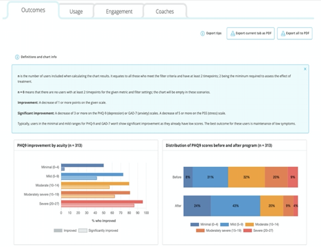
This section is focused on a breakdown of how your users are improving and the percentage who are achieving significant outcomes. You can now see breakdowns by acuity level, distributions of pre and post scores, and tables with further metrics. There are also information boxes on this page containing the definitions and calculations for the data in the charts.
In this version, we have provided breakdowns for the most widely used measurements: PHQ-9, GAD-7 and Perceived Stress Scale (PSS). Additional outcome charts and measurements will be available in future updates.

- Usage
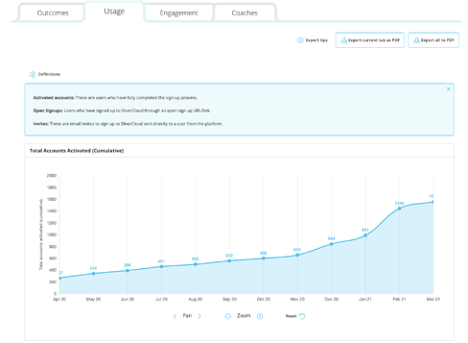
This section contains data relating to platform usage over time. You can see monthly breakdowns of account activations and breakdowns by signup method. There is also a breakdown of accounts by program usage. If additional filters are available, the corresponding breakdown will display. For example, if the filter for department is selected, the graph breakdown of user accounts by department is displayed.

- Engagement
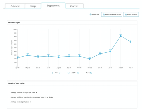
This section contains engagement stats such as details of user logins, breakdown of logins by month and module feedback ratings. These were previously available, but we have enhanced the view of these graphs. We have also enhanced how the module feedback comments are displayed. You can now see the rating, which module it was associated to and the comment (if one was provided).

- Coaches
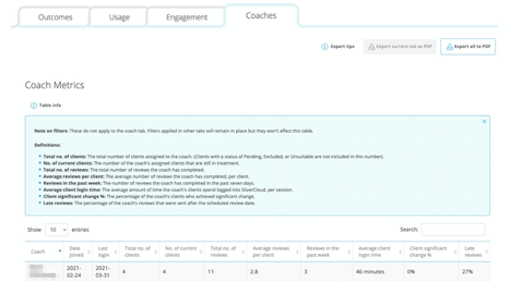
A table view with stats for each coach such as capacity metrics, client engagement and outcome metrics is now available. As with other tabs all metrics are explained in the information box at top of the table.

Exports
The ability to export the questionnaire data for all clients in the ‘Export Questionnaires’ tab at the top of the page still remains.
In addition, the ability to export a PDF version of the new dashboard is available using the following buttons at the top of each section.

Comments
Article is closed for comments.
0 comments